Saturday, April 21, 2007

A fucking moose. The pictures are messed up. I'll fix it later. Get off my back.

I made an ad around a picture of a moose. It was, to that point, my favorite thing I had done. I imagined Eggland's Best as an overprotective mother who takes a little too much credit for their son's success. I don't know what they are anymore, but that moose is pretty great.


As you can see, the third one is retarded.
The next assignment was to take the same assignment and re-art direct it. So that's what I did. I kept the copy and took out anything that made the ads interesting.


As you can see, the third one returned to being awesome so I decided to include it in the original set of three. I prefer the art direction above but for the sake of fitting it in, I, uh, changed it to fit in.


And a non-traditional. It's a bumper sticker. I'm simple.


The end.
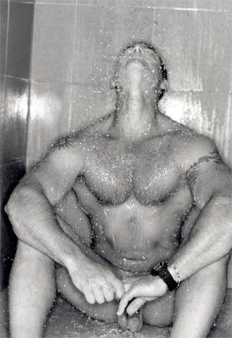
A picture of a guy

with his balls on the floor.


I would rather have this picture and not need it than need it and not have it.

Type poster.

Other people made shapes and shit.

It's so easy,

even a low-paid, menial labor worker could do it. I will not make excuses for myself. I don't know what the fuck was happening with the design. I did billboards for these, also. They are the most useless fucking things.


The only good thing about these is that Carl doesn't have a last name and one of the workers is named after a friend who I make fun of for working a low-paying, menial labor job. I am a bad person.

The worst fucking thing.

This is Sechler's Pickles. These are the worst ads I could possibly have ever done. I re-did them for final review. I'm just showing these for the sake of full disclosure. It got really bad before it got good again.


The non-traditional idea was to have grocery store tiles splattered throughout the store that gradually introduced you to all the different flavors. This was not a good time for me.

Aqualisa Quartz.

Copywriter: Natalie Shaw
Co-Art Director: Jill Lin (I designed these while she did the commercial storyboards. A commercial was actually made. I don't think a copy exists. That is probably for the best)
Person who wrote the creative brief, I'm not sure what they are: Katie Facada

For Don Just's class and the first time I actually worked with a copywriter outside of the commercial class, but those don't count.

Aqualisa is a shower system that lets you set the temperature before you get in. It takes out the unpredictability of taking a shower. I was more proud of these ads than I really had any right to be.


Blue Tip Villas.

This was a fake product. We don't know why it was fake. We didn't know solid details about the product. Nothing good came out of it and by the end of the semester, the whole thing was washed over. We were also supposed to make a brochure for the fake product. It was lazily designed. After the Jazz outing, I decided I didn't want to be a designer. Part of this copy was stolen from a 'The Broadways' song.


A non-traditional idea that accompanied this, that at least Jill thought was cool, were ads on sidewalks outside of brownstones and apartment complexes that read 'No one wakes up to the thought of warm concrete between their toes.'

You tell 'em, E.B.

A conversation with Dana.

'I am trying to rationalize an electric jug.'

- Me, on the subject of grits, and an ad that I will eventually make because I think it is adorable.

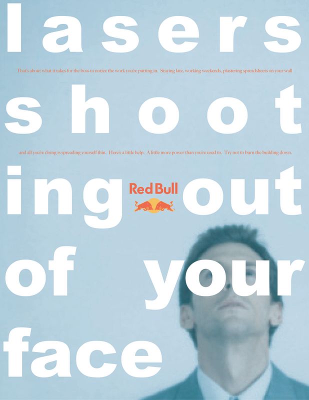
Red Bull.

We were all pretty much forced into 'guys in their mid-30s who are trying to impress their boss.' This is the result. I liked the layout so much that it ended up being my style for the rest of the semester. Big type over a picture. That's all I know how to do.


We ended up doing Red Bull ads for Don Just's class. They were fairly awful and I lost them. I apologize for nothing.

One cool idea that came out of it was a non-traditional brochure/PDA something-or-other that featured city shortcuts so that people could get where they're going faster. Please don't steal it.

I should be more ashamed of these than I am.

Herewith, every ad I've produced so far in chronological order.

Assignment: Take a bad ad and make a better one.

I came to Adcenter with the perception I was a terrible designer and wanted to prove that I could design something. Unfortunately, all this is is a redesign. Is is. I don't know. In my head, I felt like I had a concept behind it. That jazz was more than a sound, it was a feeling and la de da, now it's in a soda. I am trying to rationalize a bad ad. I'll stop.

The bad ad:


The made a better one:

Friday, April 20, 2007

As I set down these notes on paper,

I'm obsessed with the thought that I may be the last living man on earth.

- Orson Welles, radio broadcast of 'War of the Worlds'

The Grand Canyon & Niagara Falls

have been looked at so much they've become effete, sucked empty by too many stupid eyes.

- Tom Robbins, 'Still Life With Woodpecker'

There aren't many people in the world

who have the privilege to ignore empathy. But those few enjoy fantastic prices on t-shirts and shoes.

- Some dude on theprpboard

They are a good people, Kal-El.

They wish to be. They only lack the light to show the way.

- Jor-El, 'Superman'

He saw.

And in seeing, sought to do.

- V, 'V For Vendetta'

Yeah, like that.

But smart.

- Josh, to me.